Typography and content
Typography and content are so important to a website and are often forgotten.
How the text is displayed and where it is positioned are the finer points to making your website look great and reach it’s potential.
Let’s start with typography.
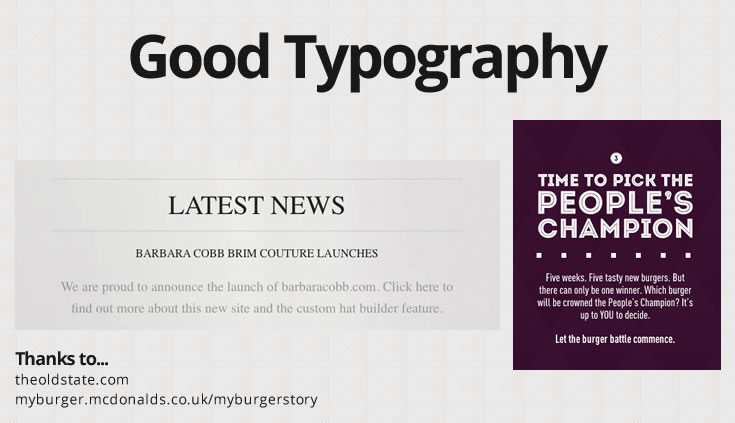
Typography is how text is displayed and how you use various font weights and styles to emphasize areas of your copy. So by adding a different weight you can push the important things – this also makes it easier for people who are just quickly scanning for information rather than wanting to read it all.
Personally, I always try to use a heavier font weight (for example, bold) for titles, then try to increase the font size which helps to show it is different. You could just use a larger font size or italics, this part is design and is so subjective. One person can love it, another hate it.
Make sure to use separate paragraphs, nobody wants to read a web page that has one big block of text, it looks boring and too much to read. Separating the content out makes it look easier to read and generally makes the page more appealing!
If you have employed a company (like us) to design your site, ensure you have your final content signed off and approved by all parties. This makes it easier for the designer to design your typography and not have to guess what your content will look like. If this is not possible, try to construct your content in the same style as the design.
If a designer has allowed a small paragraph to a section that you know will need 4 or 5 paragraphs, tell them! This makes it easier for all when it comes to content implementation. Designers are here to design the best website for you, your company and your content, they need your help to do that!
Think to yourself, if you came across your page, would you read it?

Moving onto the actual content.
It used to be the case the more content the better. Nowadays however not so much, websites are becoming minimalistic, people want information fast, and to easily find it.
Get to the point, say what you want to without all the waffle.
Having lots of content can be off-putting and nowadays we are less used to having to read & process large amounts of content on the web when searching for information, partly due to time constraints and partly because we simply don’t want to. Usually if a user clicks onto a page and is confronted with multiple large paragraphs they will skim read the first few lines then move onto a different website with clearer content.
Keep the content that will be most important to your visitors within 3 easy clicks – statistics show that if people can’t get the information they are looking for within 3 clicks, they will go to another website.
Once all content is in, ask yourself again, would you read it? If the answer is yes, great! Job done! If the answer is no, then go back and look at it again. It’s always worth asking a third party or friend to review and feedback to you too.
Conclusion…
Remember to use different weights and/or font sizes for headings. Vary your copy, use bullets, paragraphs, lists, even add an image (only if it’s relevant!). If one word in a paragraph is important, make it bold, italic or underlined.
It’s in your best interests to spend time on it and get it right. Remember first impressions last, if a first time user does not have a great experience they are unlikely to return or recommend your website/company to others. If you are a business, see what a web design agency can do for you today.

