
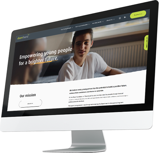
A prototype-first
charity website redesign

When The Share Foundation approached us, their website was carrying a heavy load – serving young people in care, professionals, local authorities and carers all at once. The site was in need of some updating and a redesign to improve the navigation and to reflect their professionalism and mission.
We were thrilled to win the Web Excellence award for non-profit category in web design!
With more than 6,000 active users in a single month, our brief was to deliver a user-friendly, modern website that highlights The Share Foundation’s impact, while making it simple for visitors to find what they need and take action. Recognising the life-changing work of this charity, we undertook this extensive charity website redesign entirely on a pro bono basis.
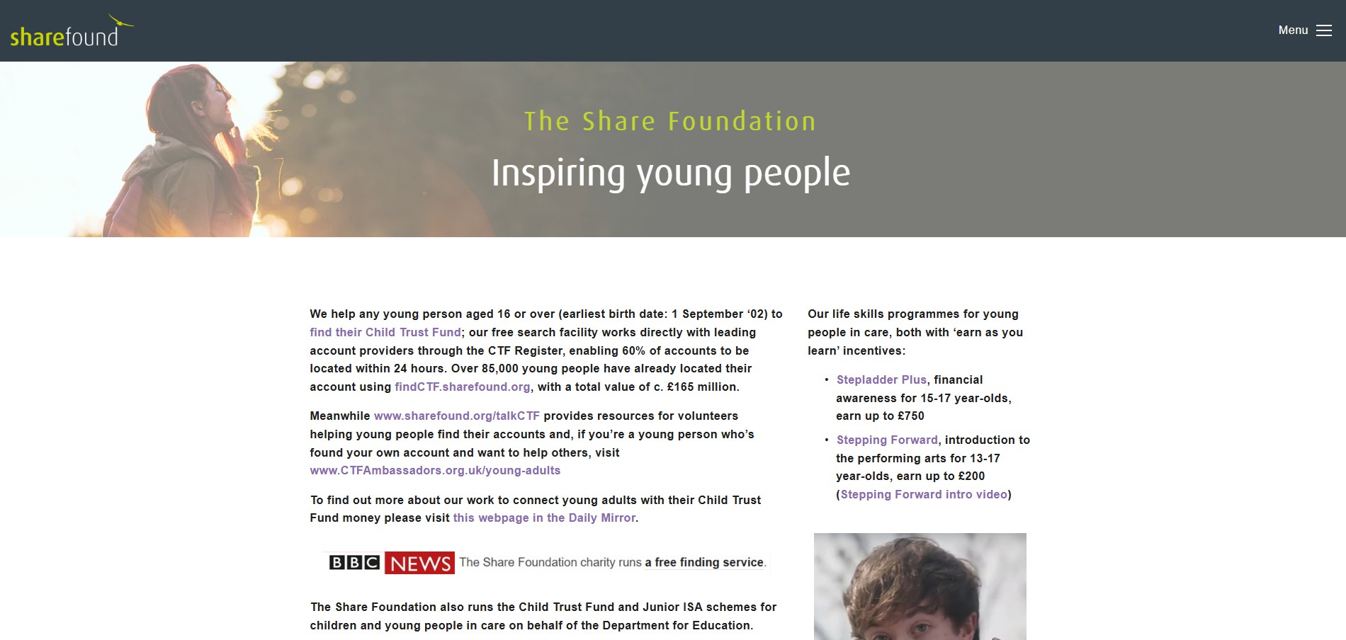
The challenge
As The Share Foundation had expanded its vital work over the years, its website naturally grew to support multiple audiences, but because the platform had to house extensive, highly detailed resources for local authority professionals, it became an information-heavy environment, overwhelming to navigate and hard to present legacy content in a clear easy to accessible way.
Furthermore, the old setup of the platform restricted layout flexibility, making it difficult to adapt the user experience for mobile devices or create engaging, interactive features. This lack of modern framework also meant the internal team faced administrative hurdles when trying to quickly update content, launch new initiatives, or maintain the site.
Our approach
Rather than working with static wireframes or mock-ups, we built a live prototype to test real interactions and user journeys based on actual behaviour.
Streamlined navigation
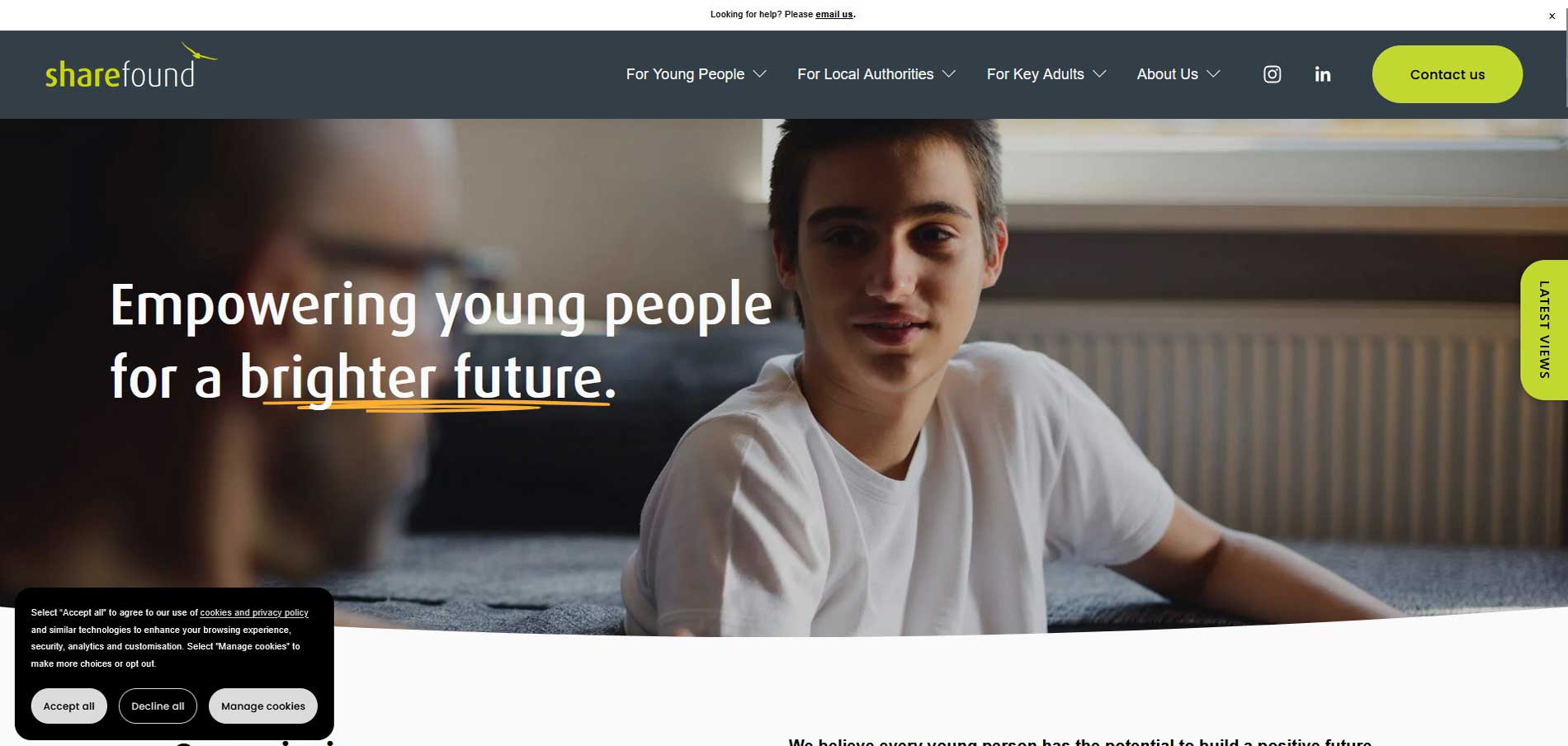
We designed a sticky top navigation bar restructured with dropdowns and user groups, highlighting the most important sections first.
Frictionless calls to action
We introduced sticky buttons for key actions alongside a clean footer for essential links. To build trust, we balanced the layout with succinct copy, testimonials, and high-quality photography.
Our design strategy focused on three specific solutions:
Audience Segmentation
We established three user-led entry points on the homepage. Young people now receive jargon-free guidance to their funds; local authorities get streamlined resource areas and tools; and carers receive reassuring information.
Content Pruning
With the help of the ShareFound team, we audited every single page, consolidating overlapping data and stripping out obsolete pages to keep only high-impact copy.
Accessibility First
We built the site on mobile-first frameworks and ensuring accessibility guidelines were met, and added a friendly welcome pop-up with an integrated feedback loop.
A modernised charity website redesign
with clear results
Increased Engagement
The streamlined navigation and clearer user journeys now make it effortless for visitors to find the right information.
The improved homepage experience balances clarity with emotional impact, reflecting the mission of the charity while remaining simple for the internal team to maintain. And the statistics are proof how engagement rates have rocketed since the launch.
+72%
User stickiness
+39%
Engaged sessions per active user
+29%
Engagement rate
"We have received great feedback for the new site and we thank Zebedee for taking the time to go on the journey with us - to listen, understand and deliver."