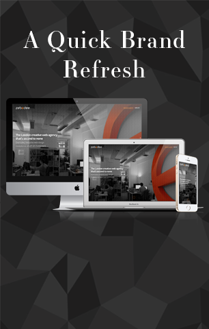
We were all very excited about the launch of our refreshed brand identity. Trends move so fast in the web design and creative industry that after just a few years our agency identity was inevitably showing signs of ageing.
Rather than going completely under the knife, we focused on our home page — taking a simpler creative journey, working with what we had, refreshing a dated look without a huge overhaul and the expense of a complete redesign. Here’s a short description of what we did to achieve this.
Our web design agency in London already had a strong logo and having been established for 15 years, we didn’t want to change the logo drastically because it’s familiar to our clients – plus we love it! Instead, we chose to simplify the digital version of our logo, dropping the ‘creations’ for a modest, more up to date version. This was a small change that complemented the minimalist effect we wanted to achieve on our home page and yet didn’t have to be applied to all other communications.
In addition, a small tweak was made to our fonts. Open sans to open sans bold for main headings, spacing between characters adjusted and colour changed from orange to black produced a much stronger, monotone design with an agency feel. To support this we created a styles guide for the web site, which evolved alongside our own brand guidelines; now all our team know the styles and it’s a cohesive, quick reference for anyone new to the agency.
Keeping the new identity consistent on all our on and offline communication was imperative to launching an effective brand refresh, so we devised a simple tracking spreadsheet to list every touchpoint to be updated. From letterheads to e-newsletters, invoices to proposals. Everything was coordinated in preparation for the launch.
To wrap up, by redesigning the home page and making delicate style changes on the rest of the web site we’ve accomplished almost a completely new look and feel. We’re super pleased with the new look. It now creates a window into our agency and sets a cool, contemporary tone with a focus on mobile usability.
We’d love to know what you think – please like or share below!

