Everything you need to know to be 2026-ready
Ah, landing pages… The miracle, standalone page that is there just to help you convert, hence the need for a great landing page builder and an even greater, idea-packed post and web design agency that will help you turn your landing page into a conversion machine!
Landing pages are fun, creative and can be A/B tested pretty easily. Not to mention that, with some great design and UX elements, the pages will be shared around and become viral.
But let’s go ahead and see how you’ll grab the audience’s attention during the seven seconds you have at your disposal, and how you’ll eliminate competition while your ARR thanks you for your efforts!
Don’t know what your landing page should look like? Dive into the data.
Landing pages exist for a single purpose: to convert. To achieve this, you must command attention from the very first millisecond a user clicks through from your social ad, search result, or email campaign.
In 2026, the most effective way to capture that attention is to weave the user’s specific concerns and motivations directly into the visual design and copy. Modern marketing has moved beyond simple problem-solving; your brand must now mirror the customer’s ideal version of themselves.
The shift toward User-Centred Design If you are not yet applying “user-centred design” principles, you are leaving revenue on the table. This approach requires you to step into the shoes of your prospect and tailor every digital touchpoint to align with their specific intent.
Leveraging AI for Persona Precision To speak directly to your customer, you must first understand their “pain points.” While traditional personas were often based on guesswork, you can now use machine learning and AI to build hyper-accurate customer profiles. This technology provides a significant competitive edge by allowing for granular segmentation and predictive modelling on a one-on-one basis.
When your data is accurate, the copy resonates deeply. The product feels like the perfect fit. The journey to the landing page feels organic and intuitive rather than just another aggressive sales pitch.
Interactive Insights and Gamification Data collection does not have to be a chore. Beyond standard surveys, consider using QR codes to gamify the experience. Whether it is a “treasure hunt” style interaction or an interactive quiz, making the user part of the process provides you with better data while building immediate brand affinity.
The Minimalist Advantage: Why “Less is More” Still Rules
Performance meets Psychology A successful landing page does not require a mountain of content. In fact, the “less is more” philosophy has never been more relevant than it is today. To convert a modern visitor, you need clean, precise lines and a layout that directs the eye without causing “decision fatigue.”
Whether it is your copy or your visual assets, every element must serve a purpose. If a visitor has to ask, “What am I looking at?” you have already lost the conversion.
Reducing Cognitive Load A landing page that is not overloaded with information helps the visitor digest exactly what they need to know. However, there is more to minimalism than just cutting down on words. By reducing “cognitive load,” you allow the user to focus entirely on your Call to Action. This clarity of purpose is what separates a high-performing page from a standard one.
The Speed Factor Beyond aesthetics, simplicity is a technical necessity. A minimalist landing page loads significantly faster. In an era where Google’s “Core Web Vitals” dictate your search ranking, speed is a non-negotiable requirement. Faster loading times lead to higher conversion rates because users never have the chance to become frustrated and hit the “back” button.
How do you achieve true minimalism? It starts with a “mobile-first” mindset. By designing for the smallest screen first, you are forced to prioritise the most essential information. Every image should be optimised, and every sentence should be polished until only the most persuasive elements remain.
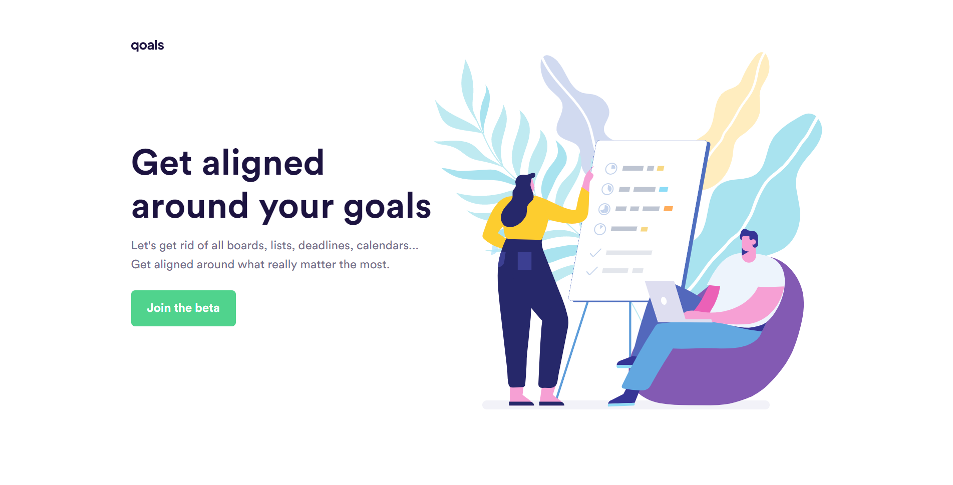
Quoals has used all the basics that will make the landing page look minimal: a lot of white space, copy that tells the user exactly what to do with actionable verbs and CTAs and colors that are simple, a little muted but contrast and won’t steer away from the brand’s colors-or the logic of them anyway.
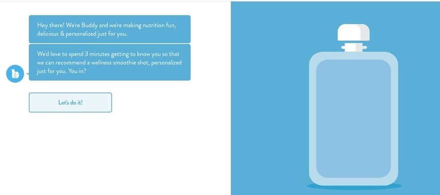
Use chatbots
A chatbot on a landing page is one of the freshest ideas that is going to be around quite a bit in 2026.
Essentially, the chatbot landing page is the landing page that features nothing more and nothing less than a chatbot, right there front and center, all ready to make the user engage and spend time on your page by feeding them information and making sure to get some feedback at the end.
A chatbot on your landing page is one of the forms of interactive landing pages and interaction is where it’s at nowadays! And let me tell you why.
Interactivity makes users stay longer on your page, which is logical, since everyone likes a little game here and there.
And you know what that means for your SERPs, right? Search engines consider you to be a valuable source, since nobody’s hitting the “back” button but, on the contrary, they’re on there and they’re spending time with your chatbot.
Chatbot landing pages are definitely a perfect way to engage people and you can use them for billions of reasons.
Imagine all the signups you’ll get with a chatbot landing page that will be talking about your event or webinar and will be giving all the information needed in a chatty, friendly tone. It will be a personal invite from a friend, rather than a blah email that can go unnoticed.
And speaking of emails, you can definitely ask for a subscription to your newsletter through those chatbots. Or, like it was suggested above, you can gamify the experience with a chatbot.
Just use the chatbot on your landing page and make it say anything you’d like it to say, whether it’s urging the user to take part in a promo or a survey. Just make sure to make it fun and exciting, in order to stand out.
Takeaway
Surely, there are more ways in which you can verify the optimal use of your landing page, but the trends that will dominate the field are the ones above.
Make sure to use videos as well, as video marketing is huge right now, and you’ll definitely see your landing page work for you like a charm!
Is there another thing you’d like to add when it comes to landing page trends? Make sure to email us and, as always, share the knowledge with your favourite marketer!
Guest Author Bio:
 Téa Liarokapi is a content writer working for email marketing software company Moosend and an obsessive writer in general. In her free time, she tries to find new ways to stuff more books in her bookcase and content ideas-and cats-to play with.