Drive greater usability
iTRACE is software for travel plan management. It provides a centralised software suite designed to monitor and report on the performance of sustainable travel at workplaces, schools and residential travel plan sites. It was developed by iBase Systems Ltd and WESTTRANS, with funding from Transport for London.
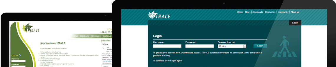
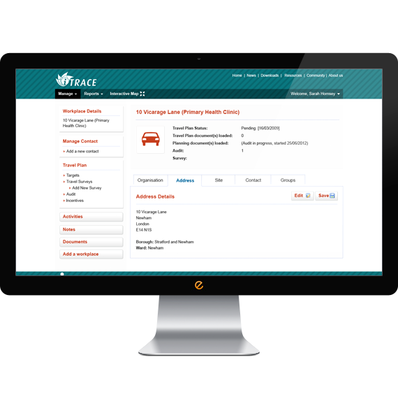
It’s mainly used by government staff, but local authorities and consultants were reporting difficulties with usability and access. Enter Zebedee, to help with Phase I of a web site redesign.
Top priorities were to redesign the top navigation and left-hand menu to make it more user-friendly, up-to-date and appealing; to provide an application interface; and to meet accessibility level 2.0 requirements while still retaining some of the existing brand identity.
The main challenge was to create this design while taking into careful consideration the existing user controls, existing master pages and DIVS. We needed to use form labels/legends in the right places, to make things go smoothly after the hand-over.
(Actually, the real challenge was curbing our addiction to puns. A travel-related site? And we get to talk about navigation and user journeys? Bingo.)
Give clearer directions
We kicked off by collecting as much information as possible, then prepared a full brief for iTRACE that they approved. This allowed us to understand the aims of the users and the type of browser and device the site would be accessed on, and to explore a new tone – all part of the basis of successful application design. We went through several iterations of wireframes, user journeys and concepts to find out exactly what approach would meet the objectives.
We applied an application design concept using icons, jQuery tabs, colours and calls to action that would minimise elements on the page and make it as simple and intuitive as possible. We cut the number of green text and links as they were tricky to read, and we created a new drop-down menu structure and consolidated the architecture, making it easier to navigate. Key factors in a good usability design are consistency and familiarity, so we created a number of templates designed to be consistent across all parts of the application, from navigation and colour scheme to iconography and styles.
The result was an HTML prototype built with user journeys and fully tested for accessibility level 2.
On the right track
We only produced the prototype, but the difference is clear. If you need a web design agency to help with your web application design, get in touch.